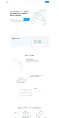
Calendly has a simple and elegant home page. Key learnings from their home page -
The first section clearly states their impactful one-liner proposition, an image that relates to the user pain point of the back and forth email and they ask for your email to signup. Anyone that is familiar with the idea of Calendly can directly signup from the top section without having any clicks on signup buttons etc.
In the next section, there is a video for users who need more convincing or understanding of what Calendly does.
Then they discussed a couple of important features with small images to reinforce the value proposition.
In the next section, they tell how many active users are using Calendly each month which is a huge number and it makes a more convincing pitch for the user to sign up as he feels like he is missing out something. This section only makes sense when your numbers are good. Right below that they mention the top companies who use Calendly to make more impact on the user's mind.