Some of the biggest design challenges include designing Signup buttons as it will be an important factor affecting your signup rate. We have accumulated the signup buttons from top-notch products so that you can learn about the size, placement, shape, color, contrast, language, etc for higher conversions. It is also important to A/B test your signup buttons to judge what converts better. Although, key factors are placement, language, size, and contrast so that it is visible to users but at the same time should not be overwhelming.
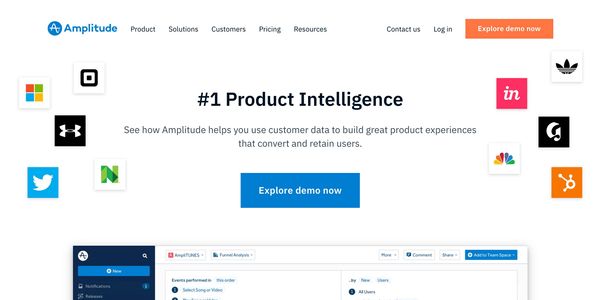
Amplitude has a medium orange color with a white text button in the top bar and a big blue button in the top section for “Explore Demo Now”. It is intriguing for me that they do not take signups directly instead they ask for emails and send an email later to create an account. This technique shows a lot of confidence in the product as they allow you to explore a complete product demo without even signing up for the product although they do ask for emails which they nurture later with their drip campaigns.
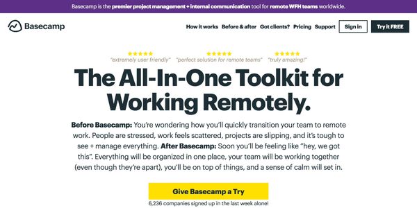
Basecamp’s theme is mostly greyscaled with a few vibrant colors here and there. They have a black and white medium signup button with the text “Try it FREE” in the top bar and a bright yellow big button with black color in the top section saying “Give Basecamp a Try”. Right below the big button in the top section, they have mentioned the number of companies who signed up in the last week. If you have an amazing number for total, last week or last day signups, you can flaunt them here to build better trust amongst users who are about to signup for your services.
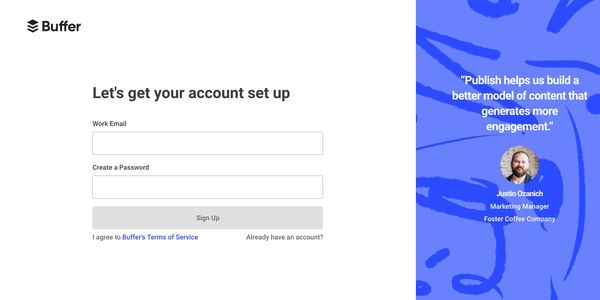
Buffer has a white and blue contrast in their buttons. They also have a medium-sized signup button in the top bar saying “Try Buffer for Business” and a big blue button with white text in the top section saying “Get Started Now”.
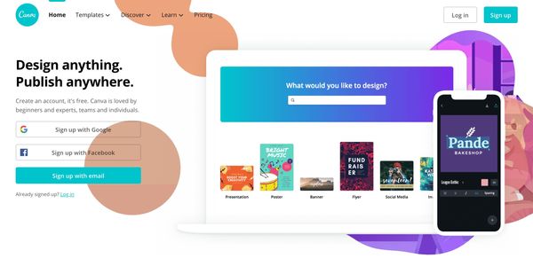
Canva has a cyan-colored signup button at the top right corner and three big signup buttons in the top section saying Google, Facebook or Email signups. Their homepage is focussed around signups and unlike other products they show all the choices with which you can signup upfront.
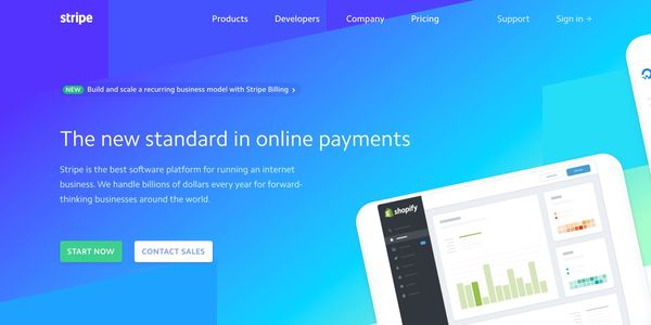
Stripe does not have any signup button in the top bar. They have a medium-sized green and white button saying “Start Now” in the top section. The background beneath the “Start Now” button is blue which frankly reduces the visibility of the green button.
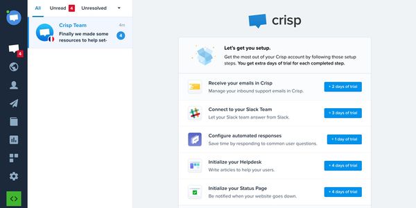
Crisp has a medium-sized blue signup button with white text in the top bar and a big same color schema button in the top section saying “Use Crisp for Free”. They mention right beneath the signup button that “No Credit Card Required” to ensure users will not be charged for trying the product as they do not take any credit card information and hence they can not charge you! Smart!
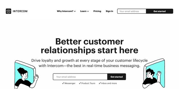
Intercom has an interesting design for signup buttons as they take email ids right beside the signup button (black and white-colored) saying “Get Started” to make it look utterly simple to signup. Although the overall signup flow for Intercom is pretty exhaustive before you can access their dashboard and you also need to give in your credit card details before completing account creation as there is no Free Trial in Intercom.
SaaS products usually have 2 signups buttons - one medium-sized Signup button in the top bar and one large signup button in the top section. Color contrast is usually dark background with the white text color. Want to know more about such stories? Subscribe to our newsletter now!