Notion has a clean black and white landing page. Let us discuss Notion's landing page section by section:
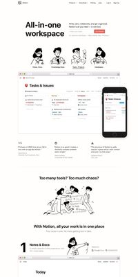
Head Section - You will see at the very top of the page, they have a single line description displayed in big and bold fonts that empathizes at the utility of the tool. Adjacent to it is a small description to highlight the main features of the tool. Below it, there is a form field that asks only for user email in a subtle manner with a button saying "Get Started". This again shows the simple and minimalistic approach of Notion that they only need Email from your end to get you started on the tool and there is not loads of fields to fill to get you started on Notion which overwhelms a user at the start. Once they have your buy-in with your email, they send you a start code in your email which also verifies your email in a sense and then there is a small onboarding process where they collect your name, team size, and your role. You see that they are asking information step by step instead of overwhelming you at the Signup step.
Overview Section - There is a quick overview section where you can easily get a look and feel for the product and the main features. It is a gif that focusses on their main features like lightweight CRM, todo list, task management, knowledgebase, etc. So, in just one GIF, you can explore the main functionalities of Notion and decide whether you should sign up or not.
Testimonial Section - There is a good chance that someone liked the product, main feature and also the look and feel but still not convinced enough to signup for the product. The next thing that helps users to signup is to build trust via testimonials. Once, you will see a list of users from various known companies who uses Notion, which increases your trust and convinces the user to signup.
Feature Section - Then, there is a detailed feature section for savvy users who would like to explore all the features in a more detailed and convincing manner to make them signup. It also empathizes on how Notion is better than the existing products because it consists of so many features in one place and serves as a replacement of multiple tools.
Online Demo Section - The next section is for an online demo where you can check out their product as a live user.
Twitter Section - They have also embedded a Twitter section where it says what good things users are saying about Notion to build further trust.
Footer Section - At last, there is a footer section for all the important links like pricing, terms, and conditions, privacy, etc.